Wimbledon Guild
Brand refresh for a charity combating social isolation and loneliness
What we did
Brand Refresh
Brand Strategy
Brand Guidelines
Social Media

The Challenge
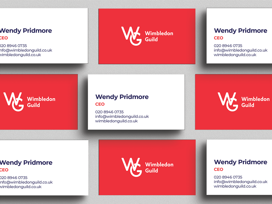
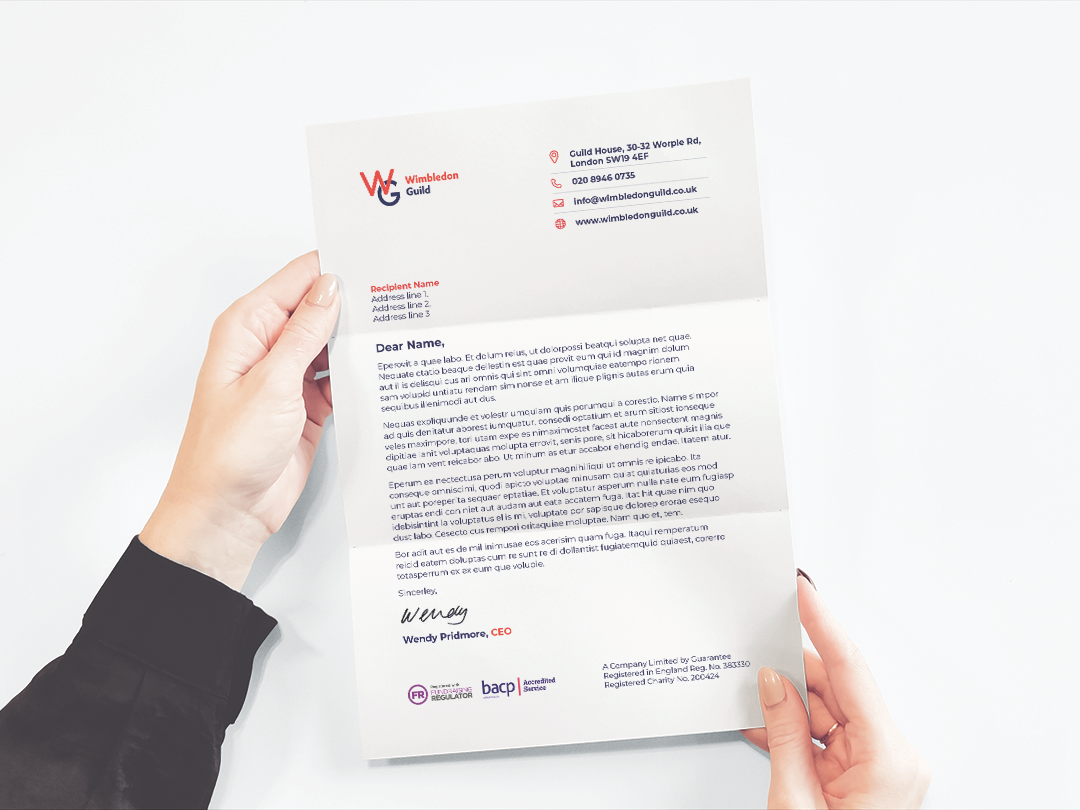
We were approached by Wimbledon Guild to develop their current branding and create a comprehensive brand guidelines document. They wanted to keep their current logo and their recognisable red as a key colour.


Zoe Davies | Wimbledon Guild


Our Solution
Wimbledon Guild’s holistic approach helped inform the visual language for the brand refresh. We created a pattern using circles, which are symbolic of wholeness and connection, whilst adding a friendly feel.
Keeping their original red, we developed a secondary colour palette which adds an inviting and warm feel to the brand.


