Wondering whether it could be time for a brand refresh? Companies often opt for a small band refresh over a complete rebrand. Making a few subtle changes with a brand refresh can be hugely beneficial for your business. Tweaking your brand identity over the years is important to keep your brand looking modern, as well as ensuring your are consistently appealing to the right audience. This could range from updating your logo, to adapting your brand messaging to remain relevant. The core identity elements of a brand should remain in a successful brand refresh. If there is a drastic misalignment between the brand and target audience, then a rebrand is likely more suitable.
Let’s take a look at some successful brand refresh examples:
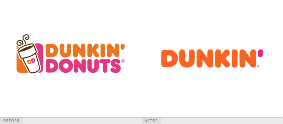
Dunkin’
Dunkin’ launched its brand refresh in 2018, in which they simplified its name and recrafted the logo. Keeping the recognisable orange and pink colour scheme and rounded font, they adjusted the logo by utilizing the apostrophe and making it pink. The new name allowed them to reflect their expanded menu as they now serve more than just donuts.
Papa John’s
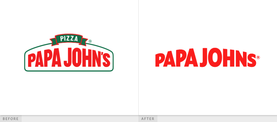
Papa Johns dropped the ‘Pizza’ in its logo, as well as controversially losing the apostrophe. They also simplified it by removing the green border. An updated colour palette inspired by their key ingredients was developed for advertising material, along with a new font inspired by stretchy dough.
Volvo
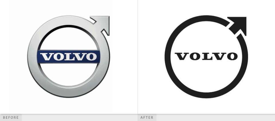
Last year, Volvo revealed a flat, less colourful version of its Iron Mark logo. The logo is a modern version of the longstanding original logo. They aimed to maintain the essence of the original logo by retaining the same shape and upward pointing arrow. This was Volvos first brand refresh in 7 years, as they followed other leading car manufacturers in the flat logo design style.
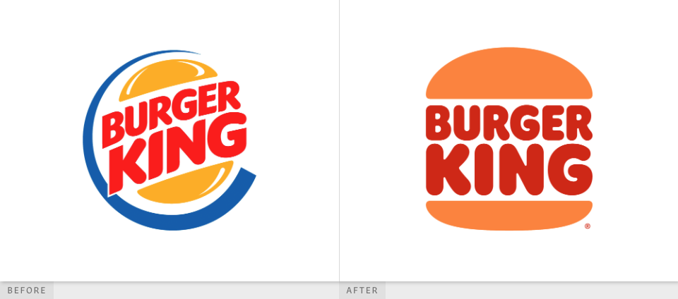
Burger King
Burger King revealed a simplified version of their previous logo, taking inspiration from their flat 1969 logo. They developed a new typeface and colour scheme which gives the feeling of fun and warmth. The retro look also helps the brand to stand out against a sea of sleek modern branding.
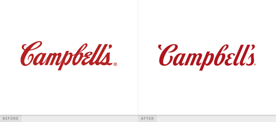
Campbell’s
Campbell’s got its first brand refresh in over 50 years, making a few subtle tweaks to its logo and iconic packaging. To stay relevant with its growing millennial audience, they wanted to modernize the brand, ensuring they stand out against competitors on the shelves. The new logotype, is still based on founder Joseph Campbell’s signature, but separated characters give logo the ability to condense and expand in a dynamic way, making it appropriate for all channels, whilst also increasing legibility.
Conclusion
The world is constantly evolving with new trends, innovations and needs from customers. Eventually, every brand needs to change, whether that is a tiny refresh or a complete rebrand.
Whichever option you need, one of the most important things to do is find a trusted branding agency. At Studio LWD, we have a wealth of experience refreshing brands and rebranding across various industries.
